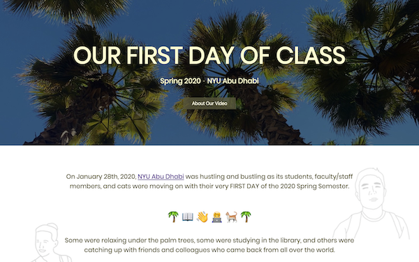
My website titled "Our First Day of Class" introduces our team's video for the 30-Minute Film Festival (30MFF), in which the video features members of the NYU Abu Dhabi community describing their first day of class in one word.
Rather than making a website that simply explains the merits of the video as a potential winning-film for the 30MFF, I aimed to capture the welcoming, casual, and vibrant atmosphere that surrounds the video and our university campus in general. I also wanted my website to fully engage the audience, who would hopefully be intrigued by its visual aesthetics as well as its interactive features. To do so, I ended up making the following strategic design choices.
1. The website's color scheme is primarily on the shades of pale-yellow, which is complemented with sky-blue. This combination of colors implies a sense of brightness and positivity. Furthermore, Poppins, which is the only font I used, is playful/casual but also simple and easy-to-read. My decision to incorporate emojis aligns with the aforementioned intentions of making my website aesthetic and not-too-crazy.
2. The background image of the header shows the palm trees on campus, whereas the background of the entire website is composed of my illustrations of people/cats we interviewed in our video. This is not only for aesthetic purposes but also to highlight that the website/video content is dedicated to NYU Abu Dhabi and its community members.
3. The text on the website is written in a style that is casual and conversational. This makes the website seem more approachable and engaging/entertaining.
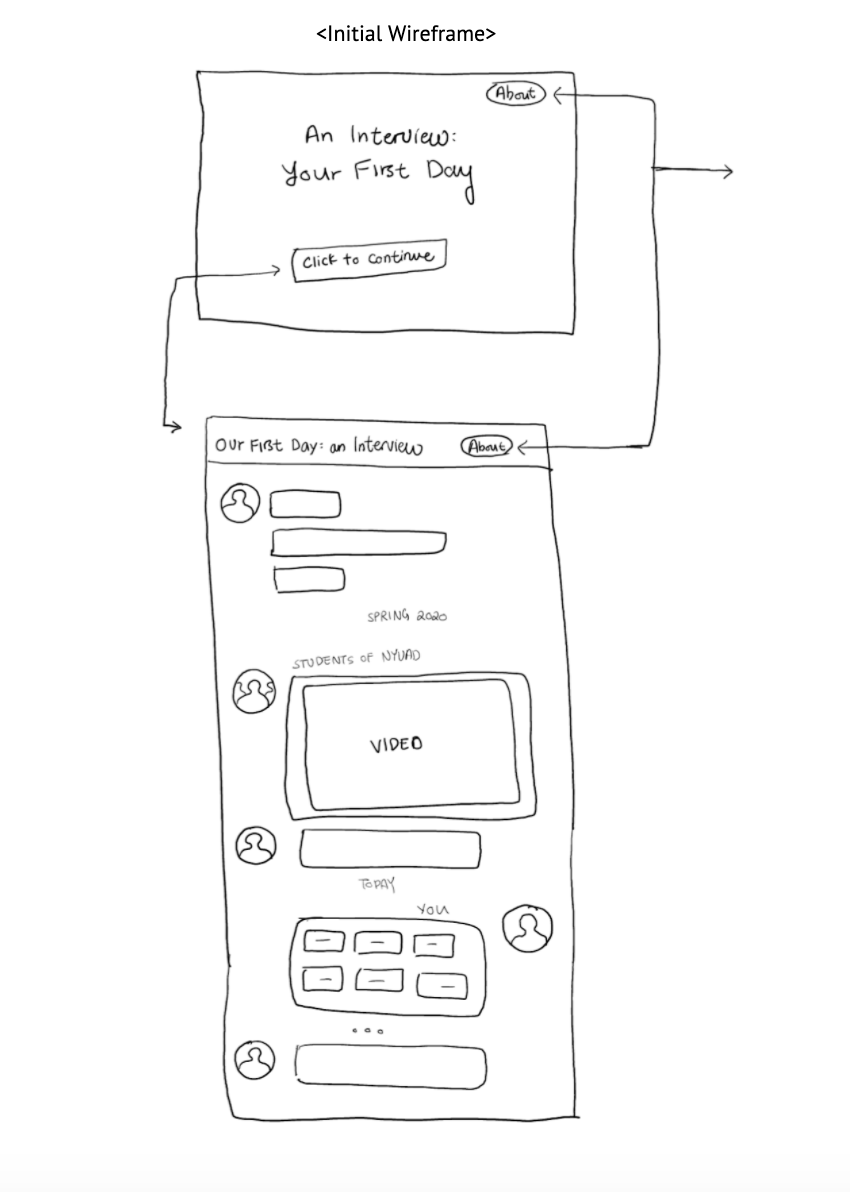
4. My first interactive feature, the "About the Video" modal, acts like a different section of the website. However, rather than making a whole new section, I wanted to use a modal because I didn't want to disturb the flow of the website by making the user go to a different section that contains a pretty short paragraph.
5. My second interactive feature, or the flipping cards, gives users a chance to respond to our question, "How was your first day of [anything] in one word?". When the user chooses an answer from the options provided, he/she gets a response (as if he/she is in a conversation with the website) with a song recommendation. This is the key interaction that takes place on the website.
Frankly speaking, I went through a lot of trial-and-errors when building my website. First of all, I got into this process with an extremely vague idea about my website's design, such as its color scheme, font, background images, etc.. Therefore, I changed my design very frequently, often just to make my website look more visually appealing. For instance, my decision to put emojis was made at the very last minute. Second, in terms of implementing interactive features, namely the modal and the flipping cards, I stumbled upon multiple obstacles and had to adjust my goals. Regarding the latter feature, I initially hoped to make it a chatting format instead of flipping cards, where the user gets to choose a response and receive a message as if the user and the website are chatting online. However, in the interest of time/resources I found, I resorted to the flipping cards feature.
Consequently, my draft wireframe (that looks like a chat-box) looks completely different from my final product. However, I do think that the overarching purpose/theme I upheld from the beginning was eventually accomplished. In fact, I feel like my final work is more engaging and appealing than what I envisioned in my wireframe. Overall, I am satisfied with the final work since this was the first website I have ever made from scratch.
References:
- HTML/CSS/Javascript Basics: https://www.w3schools.com/
- Font (Poppins): https://fonts.google.com/specimen/Poppins
- Color Scheme: https://htmlcolorcodes.com/color-picker/
- "About Our Video" Modal Feature: https://github.com/scotch-io/javascript-modal
- Flipping Cards Feature: https://codepen.io/jacoboakley/pen/ZpRbqB
- Flex Box: https://css-tricks.com/snippets/css/a-guide-to-flexbox/